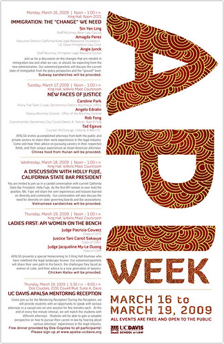
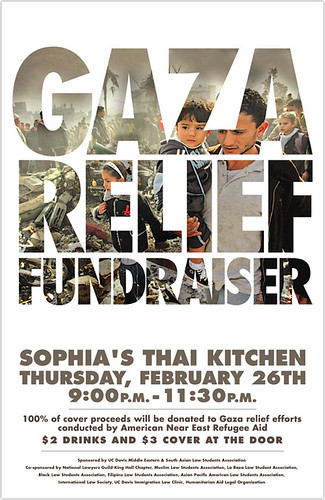
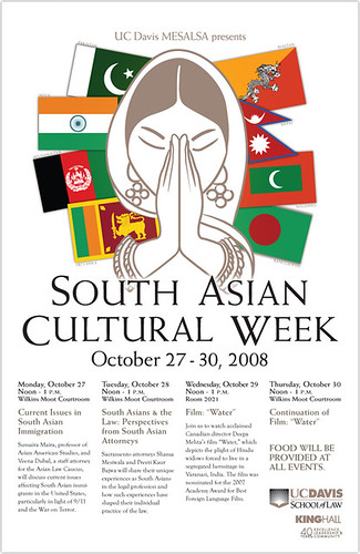
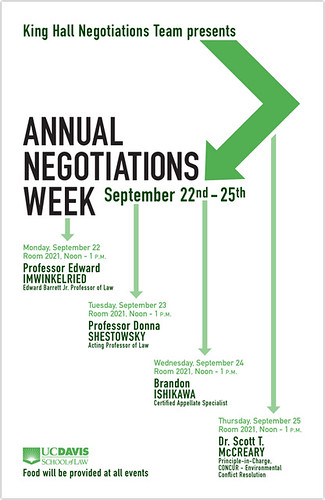
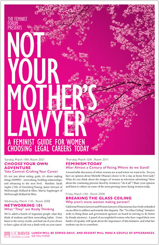
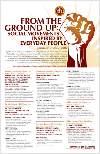
Another simple poster for a recent event. Every so often an event at the Law School will motivate me to make a non-standard poster, and this happened to be one of them. Can't exactly say why, it just happens.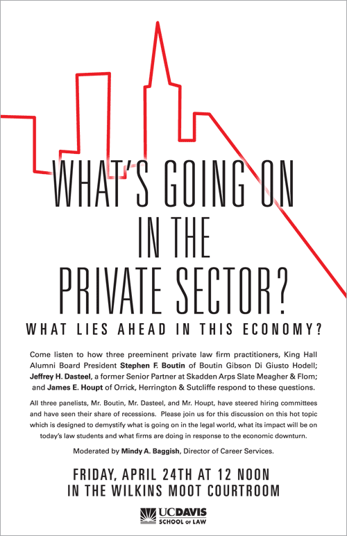
My original draft went kind of overboard with the whole "dire economic outlook" feeling I was trying to illustrate, which is why I made the more simple and clean design you see above.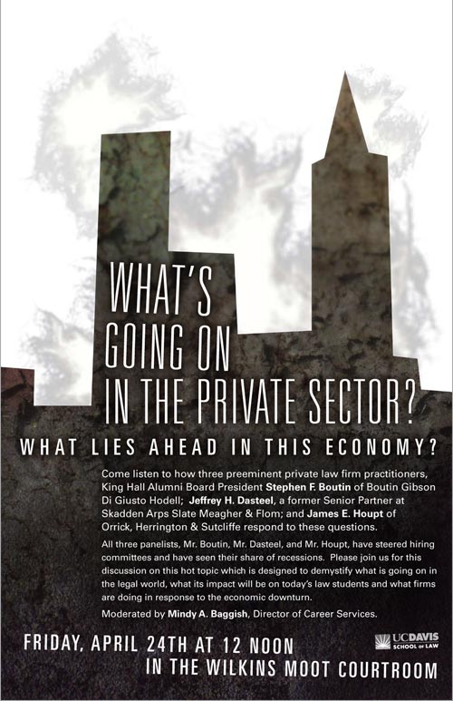
Saturday, April 25, 2009
law school posters
Wednesday, March 18, 2009
trees continued
Sunday, March 15, 2009
This book is quickly becoming a lesson in knowing when to stop, perfectly exampled by a number of spreads I will not be posting here due to being overrun with a number of bad ideas I thought were good at the time.
However, not all is lost. I've been adding detail upon detail on existing spreads in lieu of actually beginning work on the remaining ten or so that are still left.


cut and paste commentary
Tuesday, March 10, 2009
I figure an overview of my experience in San Francisco at the Cut and Paste Competition is in order. I figure this mostly because of how fun, surreal, and nerve-wracking it was. Frankly, if I didn't have such zen-like control of my bowels, I would have been shitting myself throughout the duration of the whole event.
For those not in the know, Cut and Paste is a live, multi-round design competition where eight young graphic artists battle each other by creating 2D images based on unified themes and canvases. The atmosphere is a crucible thanks to the 1,100 people in attendance, gigantic screens where your work is projected live, distinguished judges breathing down your neck, live cameraman projecting your furrowed eyebrows and sweaty forehead on an even gigantic-er screen, and intimidating competitors interested in making you look like a no-talent hack in front of strangers, your friends, and your mom.
I could go on and on, but photos seem more effective.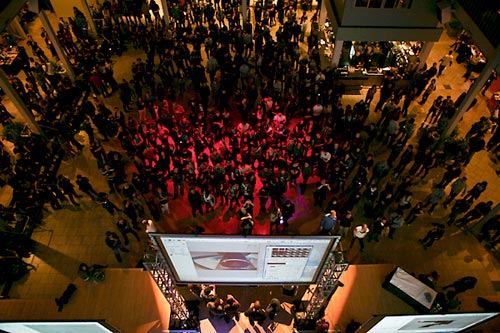
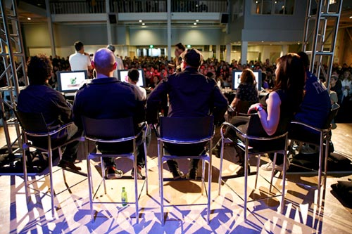
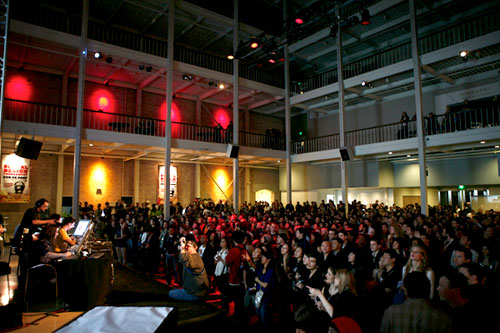
Credit for these beauties goes to Jason Lewis
So here's how it goes down: months before the event, portfolios are submitted by designers with something to prove, then from there the pool of applicants is narrowed-down and those who the powers-that-be deem to be dope enough are called back to participate in a test round. The test round uses the same format as the real event (15 minutes to create an image based on a provided theme and canvas, no pre-made artwork is allowed), except with a smaller crowd. From there, the best test-takers are invited to compete for real, eight in all, at the gorgeous SF Galleria in front of people who pay $15 to watch and buy $7 beers to enjoy it.
Crazy, I know.
It's comparable to a writer typing away on Microsoft Word in front of a screaming audience which erupts in cheers each time a sick metaphor is laid down, and "oh snap" is yelled if iambic pentameter is changed to tetrameter mid-prose.
Did I mention the screaming?
As you can imagine working on a computer isn't the most physically exciting activity to watch, so whenever a competitor does something above and beyond sitting in a chair, staring at a monitor, and clicking a mouse, it gets a reaction. I remember standing to photograph a spoon for use in one of my pieces, and being washed-over by screams accompanied with shouts of "SPOOOOOON!" from below. As self-absorbed as it may sound, and trust me when I say that for I'm a fairly self-absorbed person, it was hard not to feel like a rock star.
For posterity's sake, and for those curious, below are my submissions.
Test round | Theme: "bliss" | Canvas: t-shirt
Live round 1 | Theme: "metamorphosis" | Canvas: place setting
Final live round | Theme: "the naked truth" | Canvas: underwear
One thing I can be proud of is that I did not confine myself to a single style; I thought I made a respectable showing. Respectable enough, possibly, to win the entire thing and reap the rewards of being a champion: a sweet crown, a Wacom Cintiq, and an invitation to compete in the world championship later this year against the winners of Cut and Paste events from fifteen other international cities.
However, when all was said and done, I walked away tied for third. And while I may or may not have taken a day off from work to sulk about my loss, I realize now that I've got nothing to be ashamed about. Sure, I wanted to win about as much as I want to get the high score on my local Galaga machine--which for your information is more than I've ever wanted anything in my life--but I realize the decision making process by which competitors were either granted or denied entrance to continue in the competition was entirely subjective on the part of the judges and not grounded in any concrete criteria (more or less, all I could do was try and please myself with my work and hope for the best). In my opinion, this is evidenced by the results, where you can see that neither of the two competitors with whom I was most impressed, Emily Glaubinger and Panos Vassilladis, were selected to move on. Obviously I feel I should have won (obvious because I don't think there was anyone competing who could say any differently about him or herself without instantly being struck-down by a lightning bolt from heaven for being a dirty rotten liar). But as I hope you can tell from the previous sections of this entry, I walked away with so much from the experience alone and am terribly grateful and overjoyed to have participated at all. That, and I know Allison Torneros is going to properly represent at the world championship later this year.


And for the record, my fellow competitors are all stand-up, talented individuals; they, more than anyone, made it an experience I'll not soon forget.
Dreams of Trees update
Tuesday, February 10, 2009
I've been busy with this book. My plan is to have a first draft completed by the end of the month, and I'm trying to finish-up the general page layout as well as the larger tasks and leave myself with enough time to go back and get all the little details, of which there are a shit-ton.
Below are new spreads, as I think I've already posted many of the olds ones numerous times elsewhere.


whoop whoop
Sunday, February 1, 2009
I just found out I was accepted into the S.F. leg of the Cut and Paste competition.
I could use some support, if any of you weren't already planning on attending.
dreams of trees, continued
I spent about eight hours in the office yesterday continuing work on my book.
I swear I've got a to-do list on this book about as long as I am. This room is easily the most daunting bullet-point on that list so I figured that if I got on a roll yesterday, there was no good reason I should stop; it was a late night in Davis, the first time I've been in that city past 11:00 in months.
The room still needs a couple of hours worth of work (electrical outlets, another lamp, a ceiling fixture, and finally proper lighting) but considering I did the original illustrations two years ago, I'm happy I was able to imitate the style.
cut and paste
Sunday, January 25, 2009
Today I went to the San Francisco Cut and Paste audition round.
The theme was "bliss," and we were supposed to make the design for a t-shirt.
I find out on Tuesday if I made it to the actual tournament.
I'm crossing my fingers until they turn purple.
dreams of trees
Sunday, January 4, 2009
Not much new has been happening design-wise, there are a few Law School projects I completed since my last post and which I need to display, but frankly I've been kind of lazy the whole month of December.
However, with the help of a friend who lit a fire under my ass, I've begun to do work on my children's book that has been in the back of my mind for the last two years. It feels great to be excited about a personal project like this, and hopefully I can get it polished to the point where I'm happy to begin searching for publishers.
Somewhere on the list of things I want to rework--I'll most likely be showing progress as I move along--is recreating Thomas.
UPDATED:
ORIGINAL:
Originally he was far to small on the page, so working at a higher resolution was necessary. The updated version also fits better with the style of other illustrations. Thomas' joints still move so I'll be able to easily pose him, but I was more careful with my selections around the joints themselves so there won't be any jaggies.
I've still got a big to do list for this project, but I can't wait to get it done.
environmental-type symposium
Friday, December 5, 2008
This here is an identity for an upcoming symposium about the endangered species act.
Amongst other things, the symposium will discuss climate change and the EPA's role in the act, so I thought it appropriate to combine a photogenic endangered species with another image describing climate change.
Detail:
Don't you just love polar bears? I know I do. I also love orangutans and originally tried to use a particularly thoughtful looking one, but was shot down because the symposium focuses on North American endangered species.
Oh well, it was a good exercise in negative space--and clipping masks--to use the same background image on both a dark colored and light colored animal.
nader
Friday, November 21, 2008
Ralph Nader is coming to speak at the Law School this Monday.
I know it's way trendy what with the grunge effects and all, and while making this I think I may have been too influenced by the millions of Obama posters and materials I've been seeing for the last year. But in the end I think it looks pretty good.
weather icons
Monday, November 10, 2008
web work
It's been about six months since work was begun on this project, so it's a relief as well as an accomplishment (I believe) that the new UC Davis School of Law website was launched last week.
There's still a lot of tweaking that needs to be done before I'm prepared to call it complete (and it'd be nice if we had more than one listing in the events column, but what are you going to do?), but for the most part I'm excited to add it to my portfolio. I served as the sole designer, photographer, and art director overseeing the look of the site as it was being coded. Maybe it's just me, but comparing it to all the other UCD graduate school websites makes me even more proud of the way the site turned out. Management, Education, Medicine, and Veterinary Medicine.
Without a doubt, the most challenging part was collecting photographs of students, faculty, and alumni for use on the homepage. I'm not terribly comfortable as a portrait photographer (I prefer to use a camera as if I'm and eyewitness documenting an event or emotion, and not to tell someone to look my way and smile. Cross your arms, put your left hand in your pocket. How about leaning against that rail. No, nevermind, that looks kind of awkward. Perfect. Oh wait, my flash wasn't turned on, do that again.) and I usually feel so nervous that I want to throw up fifteen minutes before a scheduled photoshoot.
And just for the hell of it, following are the multiple drafts I went through before coming to the final design.
Hey, given that this was my first draft, it looks shockingly similar to what is online. Here's what I think happened: I was told I needed to present multiple designs to a committee of staff, faculty, students, and administration who would help decide the final design. This draft is what came out after I'd been mentally stewing on my ideas, and I was quite happy with it. In order to appease everyone while at the same time move forward with the best (in my mind) design, the subsequent designs actually turned out quite horribly. Then in comparison, you'd have to be stupid not to choose this one. It's not that I'm not open to change and suggestions (the final design looks a whole hell of a lot better than this one thanks to helpful suggestions from others), it's just that I was confident with this general layout.
Okay, this one's not too terrible, but I still don't like it.
The colors are pretty hideous, and I don't think it's even possible to present a photo this large. The page would take fifteen seconds to load, and creating an image that stretches 100% vertically presents so many problems I don't event know where to start.
Again with the hideous colors.
Really, now, it looks as if I'm beginning to chop up design elements from previous layouts and pasting them together to create new ones.
They caught on to me and said I was chopping up design elements from previous layouts and pasting them together to create new ones. So this is what I created, and would be very upset if chosen.
Lastly, I was asked to expand on my third draft. Fortunately this design was not chosen because it would not work, period. Given web standards and standard browser size, we would've had to scrap all our work if this design were to have proceeded.
Oh, and I updated my portfolio as well, and will make more updates to it within the week.
time flies
Friday, September 26, 2008
I'm having a hard time believing I last updated twenty days ago; it kind of seems like it was two days ago.
Hmmm. I guess these last few weeks of waking up a 6 to ride my bike to the Med Center to catch a bus, working all day, then going home only to fall asleep, fully clothed on my couch, at 9 makes life whiz by.
Students are back and provide me with exciting things to look at from my office window, but that's about all from them that I'm enjoying; I like this campus better when its empty.
Enough words from me; onto pictures:
I made a self-mailing thank you brochure to be sent to financial donors of the Law School. Last year (I believe I have a post about it) this same project ended up being a small booklet. This time, though, I used a die and lots of folds to create something more involved. More or less it has a roll fold, with numerous panels that open to reveal information about the programs money goes to support.
It's 5" x 7" closed and about 20" x 14" all open up. 1,500 copies produced.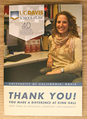
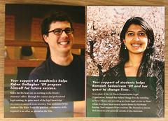
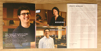
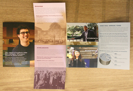
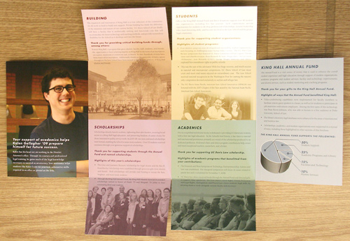
If you're a student at the Law School and you happen to befriend me, I take a cheesy picture of you smiling and looking happy, then publish it as much as I can.
I made this
Friday, September 5, 2008
I've been keeping busy lately. Apart from getting through, what can only be described as, an absolutely hellish weekend comprised of a funeral, moving to Sacramento at 3am, cleaning house the next day at 6am, and then moving someone else at 11pm; and also going through what I would call either a mental breakdown or a quarter-life crisis (the jury in my brain is still out on that one); I'm somewhat more stable.
I mean, work is still terrible, but I've just signed a six month lease in Sacramento so as far as I can tell my only professional option, beside the Law School, is a freelance career.
First, these three publications came in sometime last week: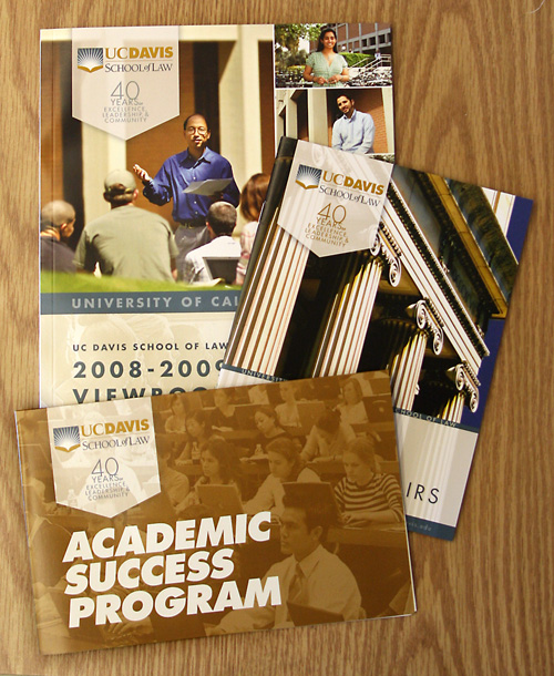
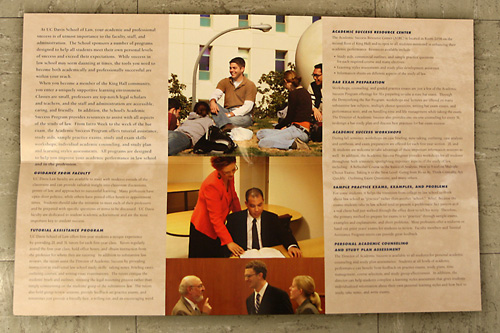
I already cataloged the two magazines in the back on an earlier post (12,000 copies of each), but the third one is completely new to this blog. It's a small brochure to be given out to law students describing a program designed to help them not fail their classes.
It's got a signature fold, and all closed up it's 8.5" x 5.5" while open it is sized at 17" x 11".
I printed 1,500 of these.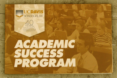
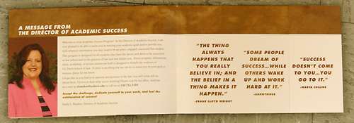
It's even got an adorable little pocket to hold pieces of paper, like the school newspaper, for example.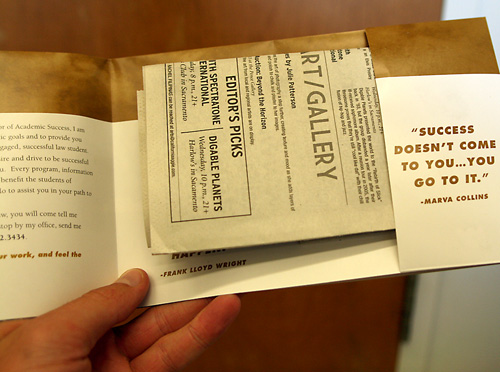
And as far as freelance work goes, first is a website redesign for a Sacramento-area dance studio.
Moon colors were used, while light and fancy were the underlying feelings behind the design.
Last is a kind of ugly--but for some reason one that I totally love--t-shirt design for my softball team. 
Really, though, no need to offer any criticism. I know it's horrendous.

